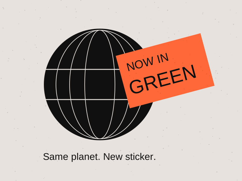
We made the logo green. The planet remains unconvinced
A leaf icon has volunteered to carry the entire sustainability strategy.
False idols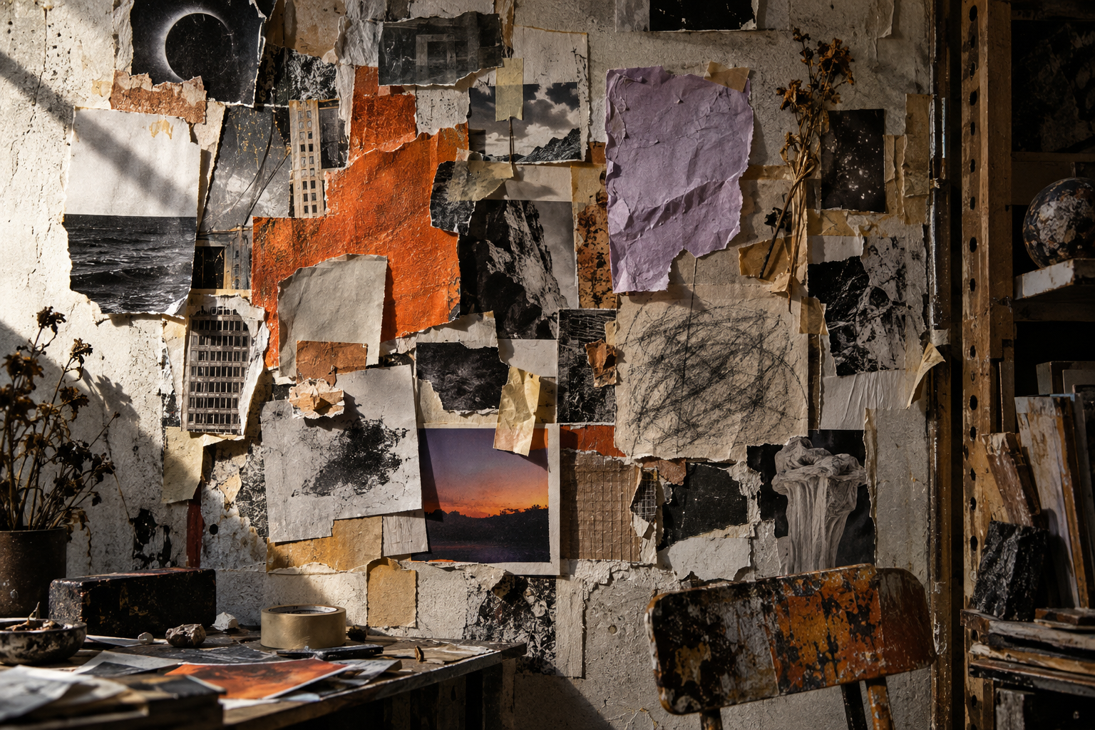
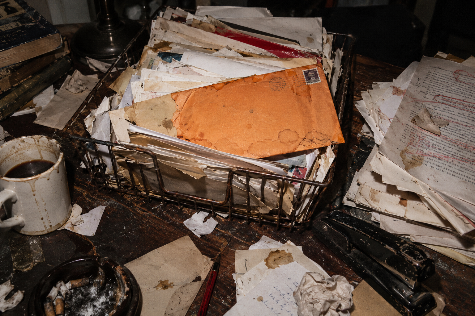
We spent the afternoon making a perfectly good file look as though it survived a basement flood.
A torn edge appears. Then another. Someone adds photocopier noise until the headline resembles evidence recovered from a pond.
Rough texture can give a piece character. It can also become a surface treatment applied to compensate for an idea that has not arrived. A distressed rectangle is still a rectangle with a meeting to attend.
Ask what the material contributes. Does it suggest handling, cheap reproduction, a particular setting? If the answer is only “it looks less digital,” try a version without it and see what remains.
Make a physical sample when the project allows. Fold paper, scan a mark or print something on an imperfect machine. The result may contain a useful surprise that a preset would not have offered. Keep text legible at the final size.
Using generated imagery? Be honest about the process. An invented coffee stain is not proof that a human spent three sleepless nights making the work.
There is no prize for damaging the file beyond the point where anyone can read the message.
A leaf icon has volunteered to carry the entire sustainability strategy.
False idols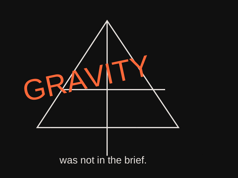
An attractive image has arrived with no visible means of standing up.
False idols
The shortcut works beautifully. The decision is still standing outside, waiting to be let in.
False idols