The logo animation has requested its own dressing room
Six seconds of choreography before you are allowed to learn what the company does.
Revision hell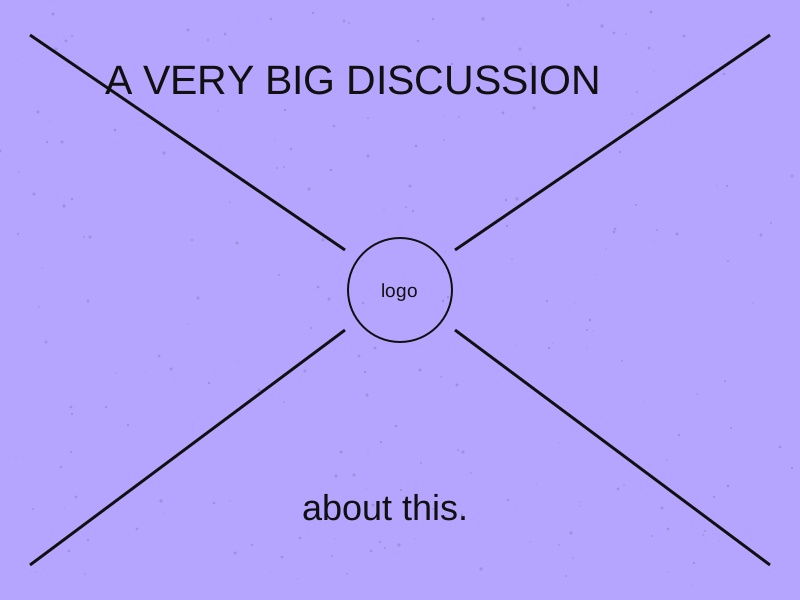
A discussion about recognition has accidentally become a discussion about acreage.
The logo grows. The headline shrinks. Somewhere, the actual message is considering a move to another page.
When a client asks for a larger mark, find out what they think the current version is failing to do. They may be worried about recognition, visibility or the relationship between the brand and the product.
Show the design at its intended size and in context. A mark viewed on a large presentation screen can produce a different impression from the same piece on a phone or a shelf.
Compare a small number of options and explain what changes in the hierarchy. If the logo takes more attention, something else gives it up. Make that trade-off visible rather than turning the discussion into a contest of personal taste.
Sometimes the logo genuinely should be larger. Change it when that serves the communication.
The goal is not to win a historic battle over twelve pixels. Nobody needs a commemorative plaque for the original size.
Six seconds of choreography before you are allowed to learn what the company does.
Revision hell
The brief requests something nobody has seen before. Please attach three proven examples.
Revision hell
Everyone wants something fresh, provided it has already been approved.
Revision hell